Images are an important aspect of the webpage as it helps in enhancing the user experience.
When users see two or three images on the content instead of full text, they are likely to read the full content which signals the search engine that the website has a good user experience and increases the ranking.
Images on the website consume a lot of space and there is a chance of a decrease in loading speed, to solve this problem, we have to size the images properly on the website.
If we upload images larger than the website needs then the “properly sized image” issues occur.
Properly sized images are essential for maintaining a good user experience, contributing to faster page load times.
What is Properly Size Images?
Properly sized images refer to images that are optimized to fit the dimensions required by the webpage
If the images of the website do not fit the size of the website, then Google shows the “properly sized images” error on Pagespeed Insights.

This is how the Properly Size Images warning appears when you analyze your website on Pagespeed Insights.
On different devices, images show up at different sizes, depending on the screen size. If images are too big, the browser has to shrink them down to fit.
This means users have to download unnecessary data, which makes the page take longer to load and wastes their mobile data.
To enhance the user experience, Google cares about the “image size” and it is an important page experience metric.
What causes the “Properly size images” warning?
The main cause of the “Properly size images” warning is the size of the images on the webpage is larger than necessary for the user’s screen.
The other causes are,
- Uploading high-resolution images
If high-resolution images are uploaded without resizing them to match the dimensions needed for display on the webpage, they can exceed the necessary size.
- Using images with excessive dimensions
Images with dimensions larger than required for the webpage layout cause the warning, as they take longer to load and require resizing by the browser.
- Not optimizing images for the web
Images that have not been properly optimized for web use (for example you can use webp format instead of png or jpeg) resulting in larger file sizes than necessary, can trigger the warning.
- Responsive design issues:
sometimes Inconsistencies in implementing responsive design methods may lead to serving larger images than needed for certain screen sizes, causing the warning to appear.
Example:
Let us take this example
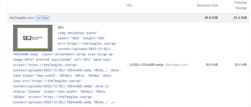
This is an image uploaded on the website, somehow Page Speed insights triggered the properly sized image error and you can also see the potential saving nearby as 25.4 KiB
The reason for this error is the website needs some other dimension but you uploaded the image larger than the required dimension
How to Effectively Resize Images?
Now that you have understood the causes of the properly size image error, you can spot the error with the help of the Pagespeed Insights tool.
Inevitably, the images are not properly sized in the above example so now we will deal with how to resize the images.
To resize the image, first, you need to find the image size contradiction in the website, To do so,
Open the image in the new tab and inspect it
You will get the exact dimensions of the image in the Image URL and the required dimension in the inspect column.
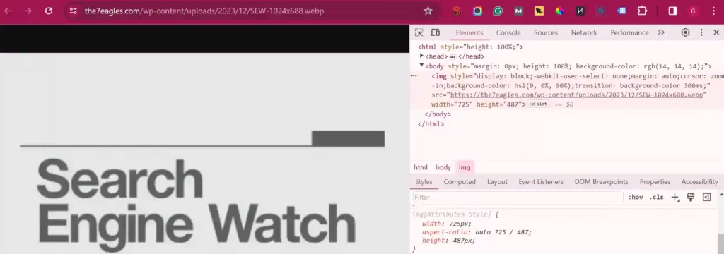
In this example image, the dimension in the image URL (original dimension of the image) is 1024*688, but the dimension needed for the website is 725*487.
It is obvious that due to variations in dimensions, the properly size image error occurs on the website.
To resize the image, you can modify the dimensions(height and width) of the image or reduce the file size.
Both dimensions and image size are interrelated, if you reduce your image size then the file size will be reduced
There are many image compression tools like JPEG Optimizer, Tiny PNG, and Photopea, you can also choose your normal photo editor to reduce the image size.
Before compressing the image, you should identify the size of the layout where the image is to be uploaded.
To find it, inspect the element in the chrome where you can find the size of the layout.
Whether you’re using Chrome, Firefox, or Safari. Just right-click on any webpage element and select “Inspect Element.” This will immediately show you the dimensions of the selected content area.
How Incorrect-sized Images Affect the Performance?
Incorrectly sized images have a greater impact on website performance in several ways:
Increased loading time:
Images that are larger than necessary take longer to load, especially on slower internet connections or less powerful devices.
This can lead to higher bounce rates as users become frustrated with the slow loading times and leave the website before it fully loads.
Excessive data usage:
Larger images require more data to download, which can be particularly problematic for users accessing the website on mobile devices with limited data plans.
This not only increases the load time but also consumes unnecessary data, resulting in higher costs for the user.
Poor user experience:
Slow loading times and excessive data usage due to oversized images can result in a poor user experience.
Users may think the website is unresponsive or poorly designed and may not return in the future.
Negative impact on SEO:
Website speed is an important factor in search engine ranking algorithms.
Slow-loading pages due to oversized images can result in lower rankings on search engine results pages, reducing organic traffic to the website.
Increased server load:
Serving oversized images consumes more server resources, including bandwidth and storage space.
This can lead to higher hosting costs and may even cause server performance issues, such as slowdowns or crashes, especially during periods of high traffic.
How to Fix Properly Size Images Issue?
There are seven ways to fix properly size image issues they are
- Manually resize the image
- Make use of WordPress Plugins
- Use srcset
- Check for Image Formats
- Define image dimensions in HTML
- Implement lazy loading
- Implement responsive design
1. Manually resize the image
As I mentioned above check for the website’s layout format, manually resize the image accordingly, and upload it back to the website
This will remove the properly size images error in the Pagespeed Insights.
You can use photo editors or any online image compression tools for this purpose.
2. Make Use of WordPress Plugins
Many plugins help in optimizing images and reducing the “properly size image” errors, The most used plugins are WP Compress, Smush, TinyPNG, and WP Rocket.
These WordPress plugins help solve “Properly Size Images” errors by automatically optimizing images to reduce file sizes and ensure they fit the dimensions required by the webpage.
These plugins offer features such as image compression, resizing, lazy loading, and CDN integration to improve website performance and user experience.
3. Use srcset
To solve “Properly Size Images” errors with srcset, provide multiple image sizes in the srcset attribute of <img> tags, enabling browsers to choose the appropriate size based on device capabilities.
Test and adjust the implementation to ensure optimal performance and avoid errors.
This is an example of how you can use the srcset attribute in an <img> tag:
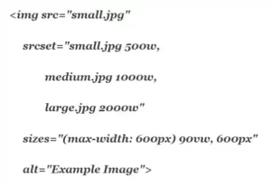
In this example:
- The src attribute specifies a fallback image (small.jpg) for browsers that do not support srcset.
- The srcset attribute lists multiple image sources (small.jpg, medium.jpg, large.jpg) with their corresponding sizes (500w, 1000w, 2000w).
- The sizes attribute defines the sizes of the image at different viewport widths, with 90vw indicating that the image should be 90% of the viewport width on screens smaller than 600 pixels, and 600px specifying a fixed size for larger screens.
- The alt attribute provides alternative text for screen readers and in cases where the image cannot be displayed.
This needs the proper implementation and the developer’s help, if you feel it is too technical, just go with the WordPress plugin method.
4. Check for Image Formats
Prefer using JPGs over PNGs for better optimization.
Another suggestion is to use Webp format while uploading all images on the website which helps in optimizing images.
You can also consider using a paid image optimization plugin like Imagify, which not only compresses images but also converts them to .webp format, eliminating the “Serve Images In Next-Gen Formats” warning.
5. Define image dimensions in HTML
You can include specific height and width attributes within the image tags, such as <img src=”properimage.jpg” alt=”Proper Image Error” width=”500″ height=”300″>,
By doing so you are providing browsers with information on the image’s size, enabling them to allocate the necessary space during page layout and this helps in eliminating “Properly Size Images” warnings.
6. Implement lazy loading
The another way to eliminate the properly size image is to Integrate lazy loading techniques into your website.
Use the code loading=”lazy” attribute in image tags, like <img src=”properphoto.jpg” alt=”Proper Image” loading=”lazy”>.
This delays the loading of off-screen images until users scroll to them, reducing initial page load times.
There are many wordpress plugins available like WP Rocket to do lazy loading process.
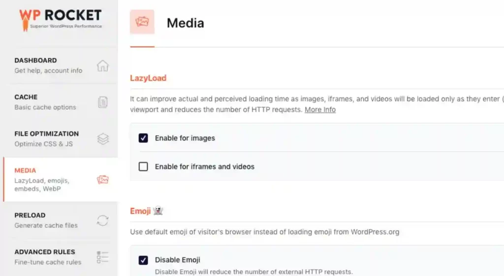
This is the dashboard of WP Rocket, the most used plugin and you can turn on the lazy load option.
7. Implement responsive design
Implementing responsive design is an effective way to create a different layout for different devices.
Many WordPress themes come with built-in responsive design features.
With responsive design options in WordPress themes, elements such as images, text, and layouts automatically adjust based on the screen size of the device being used to view the website.
You can also create a responsive website layout using CSS media queries to adjust image dimensions based on the user’s device screen size.
This ensures that images are appropriately sized for each device, eliminating “Properly Size Images” warnings and optimizing the user experience.
Conclusion:
Properly Size Image is an issue to be noted because it directly affects the User experience of the website, If your website has image size issues, use one of the above steps to resolve it.
Using any WordPress plugin for image optimization is recommended as they are user-friendly and have many features other than image optimization.
If you need help in technical SEO services, check out our services and we are ready to help.

